Quality outdoor gear hand-built in the Pacific Northwest.
For my final term of college, I worked with Professor Michael Salter, director of the Art and Technology program at the University of Oregon, on a brand design and development project. The brief I created was for an outdoor apparel brand in the Pacific Northwest that emphasized quality. Inspired by guilds and artisans like blacksmiths, carpenters, and leatherworkers, I wanted the brand to feel historic - almost medieval - while still following modern design principles.
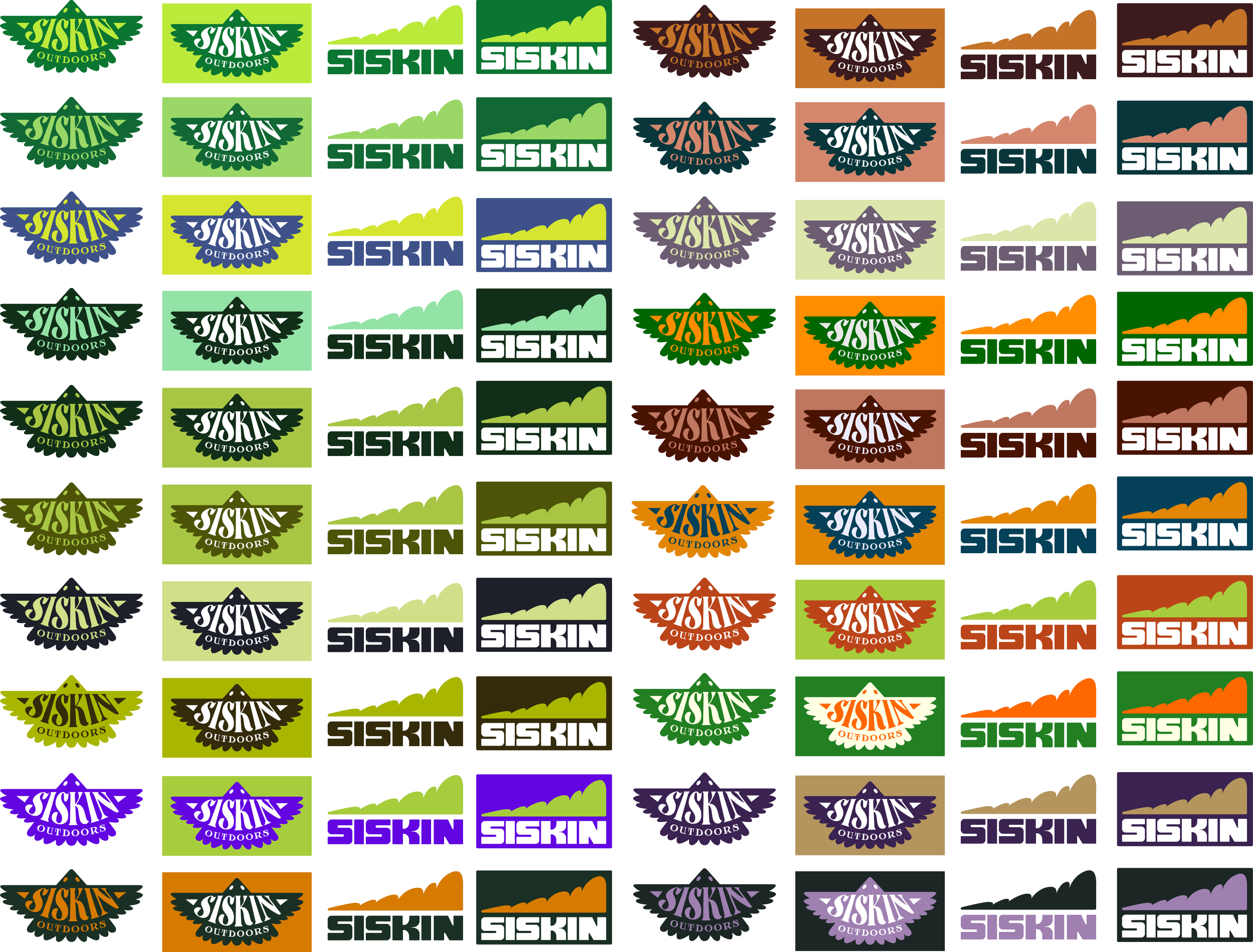
The first part of the term was spent developing the brand logo. I spent a lot of time on this phase because I knew that the right logo would set the rest of the brand design up for success. Eventually, I landed on two logos to be used in conjunction:
Sketches:

Color Scheme:
The natural next step I felt was developing a color scheme for the brand. I wanted to chose colors that met AA contrast standards, and felt both natural and modern at the same time. This was arguably the hardest step for me, as each color combination I tried felt just as fitting, which I took to be a testament to a successfully designed logo. Eventually, we both decided that locking into two colors wasn’t necessary for our purposes. Instead, I chose a few color combinations that I was pleased with, and used the same color language throughout the project. If I were to take Siskin further I would choose two-three colors to stick with to help customers identify the brand.
Product and
Marketing
Development:
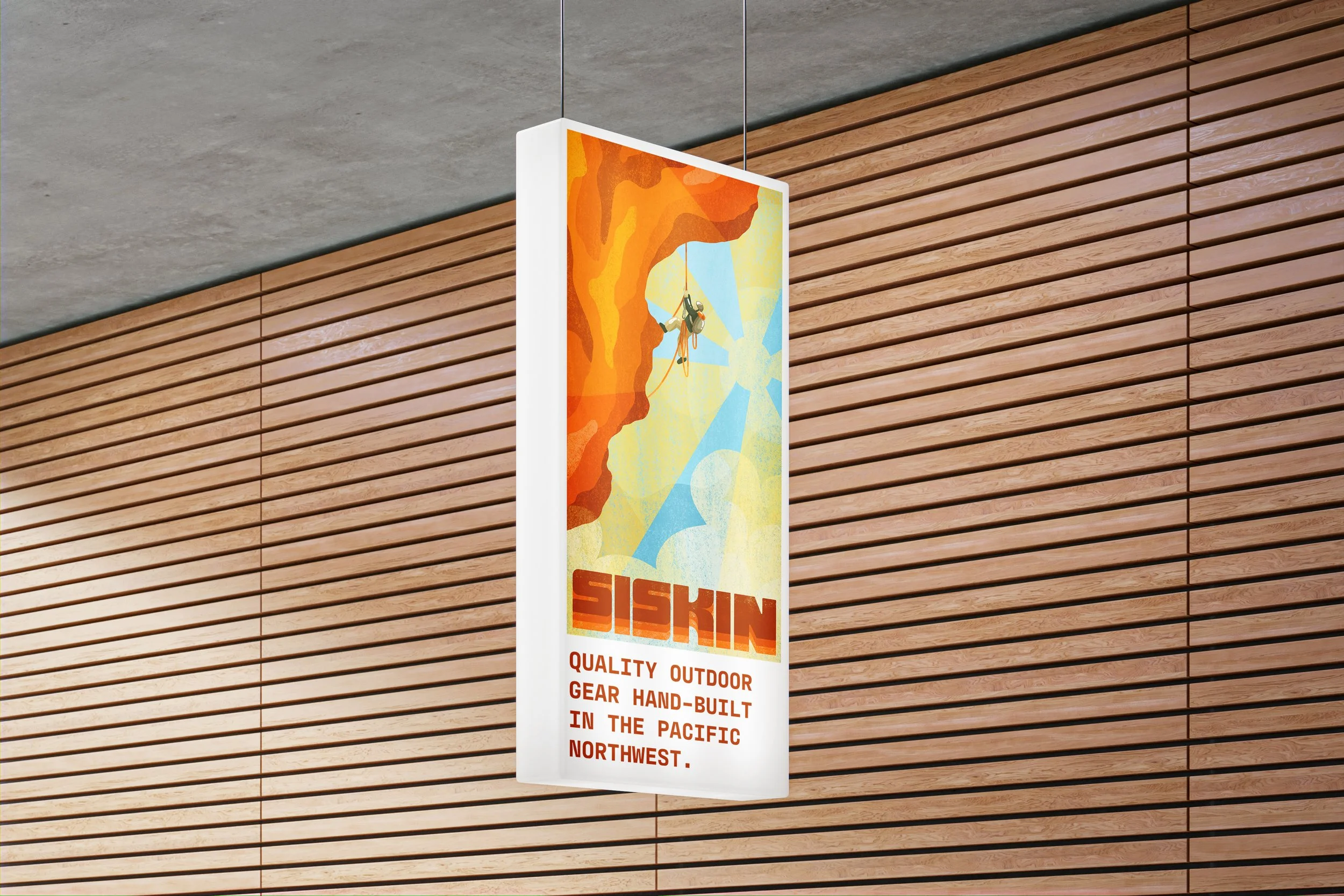
I wanted a few physical products I could use to field test the logo and to give some substance to the brand page. I did an outdoor photoshoot with four products I created, and made a page with fake listings for people to see them. I also created a series of digital and physical ads, as well as designed and modeled a traveling pop-up. shop for the brand.
CAMPING DRINKWARE:
A mug-flask combo made of double-walled aluminum to keep your drinks cold or warm. Perfect for a night by the fire or a morning pick-me-up.
$29.49
FOLDING FIRE PIT:
A foldable fire made of stainless steel for you and your friends to tell stories around, anywhere you go.
$49.99
CHOPPING BOARD:
A small, lightweight, and durable chopping board made of bamboo, with an engraved Siskin logo right smack in the middle.
$14.99
SISKIN DRIVER:
An overstable fairway driver made of a durable bright-yellow plastic for when you miss the mark. 5/6/-1/0.
$17.99
Pop-Up Shop
What better way to celebrate the start of an outdoor brand than with a pop-up shop run through an Airstream trailer out in the woods? Designed through Cinema4D and filled with various products, merch, and artwork I developed throughout the project.


